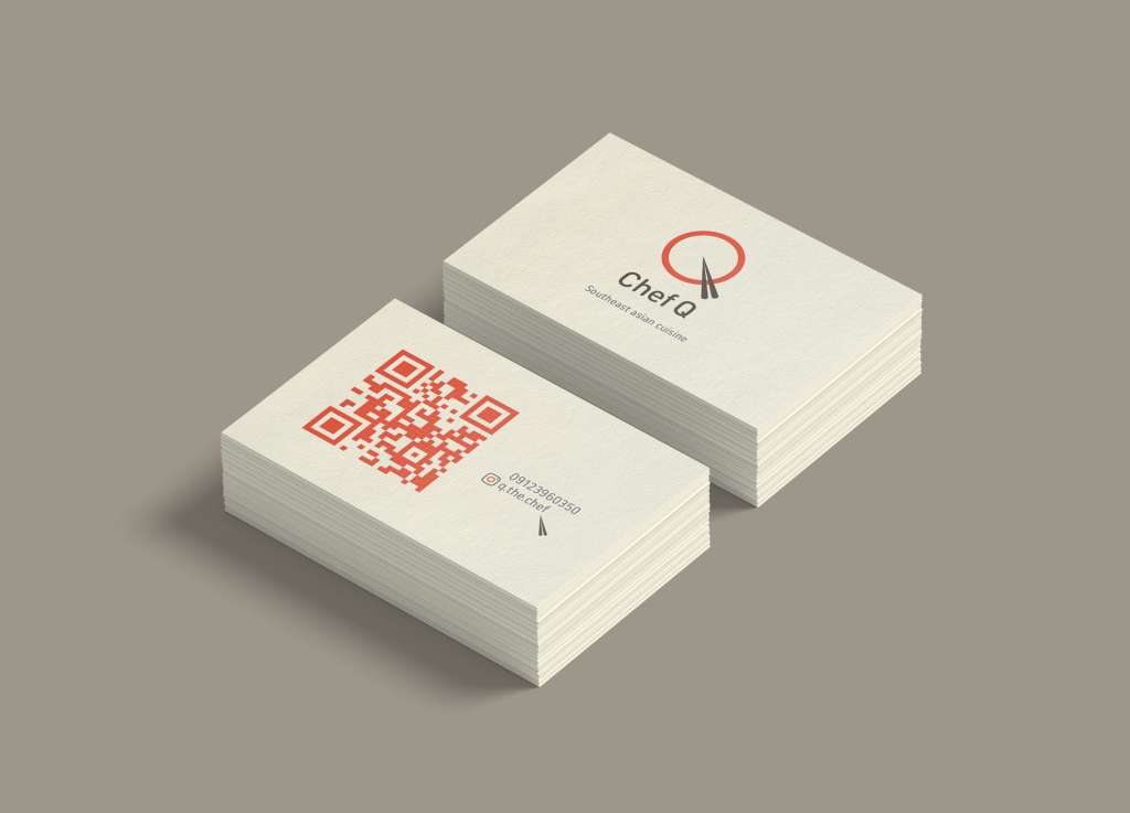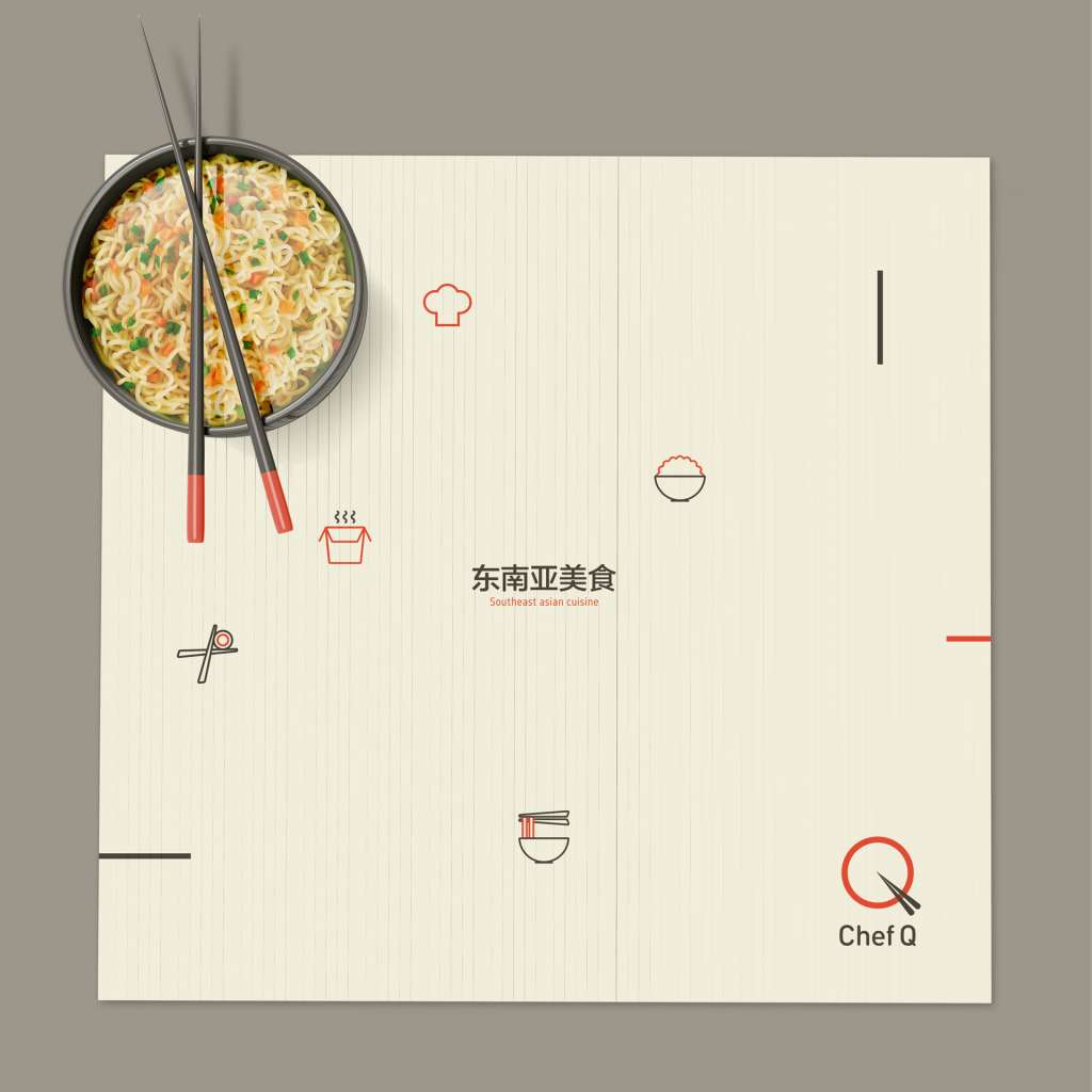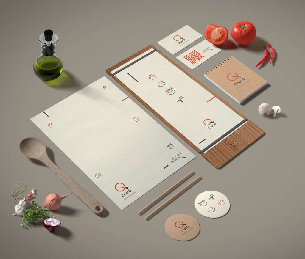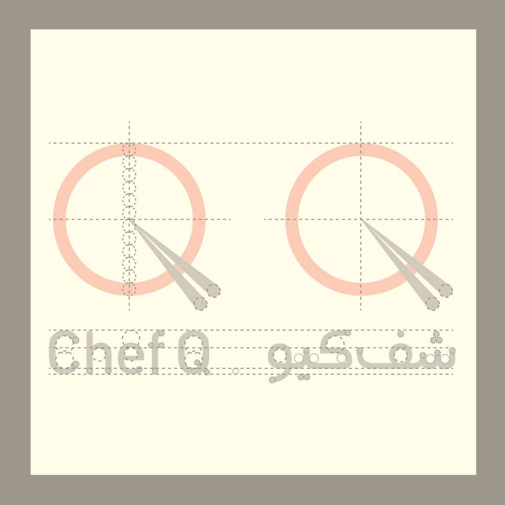


In 2017, I developed the brand identity and logo design for Chef Q, a professional chef specializing in authentic Japanese cuisine. The design concept focuses on merging minimalist aesthetics with cultural elements, utilizing a clean and modern logotype that incorporates stylized chopsticks within the letter “Q” to symbolize culinary expertise. This visual system extends across various touchpoints, including stationery and custom signage, creating a cohesive and sophisticated brand presence. The choice of a vibrant, minimalist color palette reflects both the freshness of the ingredients and the precision of Japanese cooking, successfully positioning Chef Q as a distinguished professional in the culinary field.