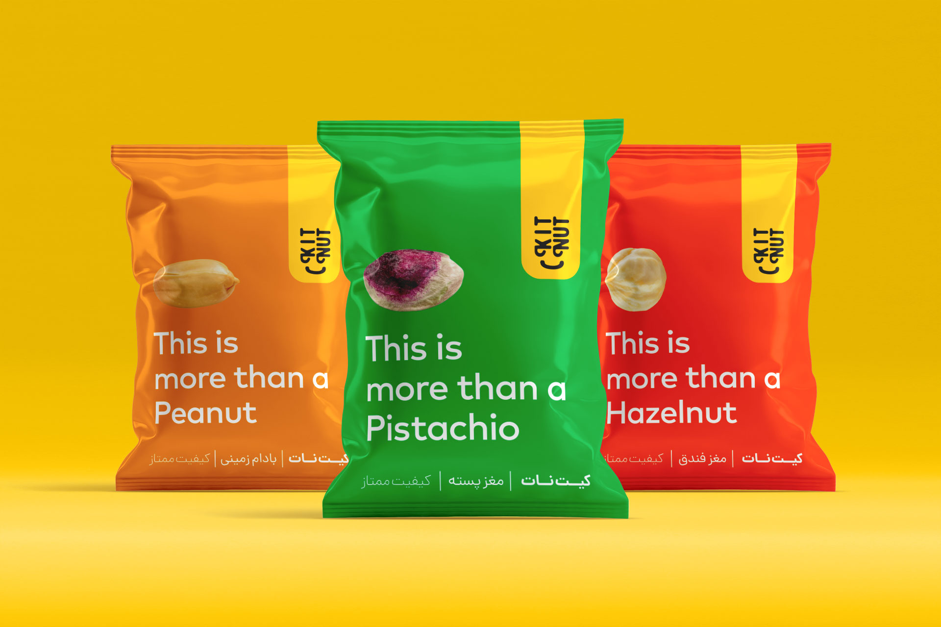

In 2019, I designed the packaging for Kitnut, a premium brand specializing in nuts and dried fruits. The core concept of this design focuses on a minimalist and bold aesthetic, utilizing vibrant, solid colors to create a strong visual impact on the shelf. By featuring the phrase “This is more than a…” alongside a clear, high-quality image of the specific nut, the packaging tells a story of quality and premium experience beyond just a simple snack. The design balances modern typography with clean layouts to communicate freshness and sophistication, ensuring that Kitnut stands out as a high-end choice for consumers.